Designing Election Graphics That Stay Neutral
Notes from building the visual system for Al Jazeera's U.S. Presidential Elections 2024 coverage.
 Omar FawziSenior Art Director, Riyadh ·
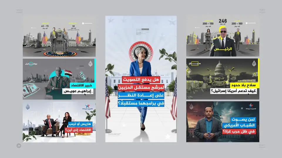
Election coverage is one of the most sensitive jobs in news design. Every colour, size and position can be read as a political signal. When I led the visual direction for candidate profiles, electoral maps, polls and live results, neutrality was not a style choice; it was the brief.
Equal treatment, measured
Candidates received the same photo treatment, the same space and the same typographic weight. We checked it the way you check data: side by side, at every size.
Colour carries meaning
Party colours are part of how audiences read results, but colour can also exaggerate. We used them consistently and calmly, and never as decoration around the story.
Maps that do not mislead
Electoral maps can give a false impression when large, less populated areas dominate the picture. Clear labels, totals and supporting charts helped the audience read the real result, not just the colour of the map.
A system for live nights
Results changed by the minute. Templates had to accept new numbers instantly, handle long names and stay readable on television, web and social at the same time.
What I carry into brand work
Neutral design is disciplined design. The habits I built in election coverage, such as equal treatment, careful colour and clear hierarchy, make every brand system more trustworthy.